When the World Fit on a Roll — How a Single Classroom Map Defined America's View of Everything
The Map That Ruled the Room
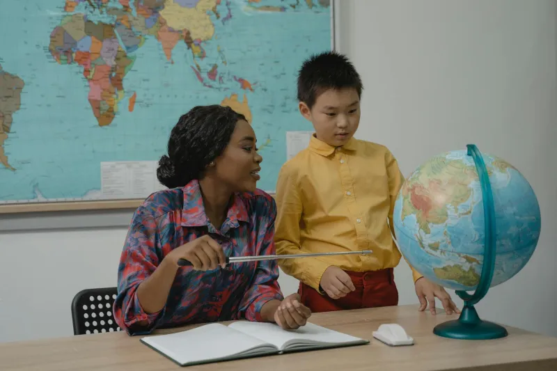
Walk into any American classroom between 1950 and 1990, and you'd find the same commanding presence above the chalkboard: a rolled-up world map, its wooden dowels worn smooth by decades of teachers pulling it down with that distinctive snap that meant geography lesson was about to begin.
That map — usually a Rand McNally or Nystrom creation — wasn't just a teaching tool. It was America's window to the world. For most students, it would be their primary visual reference for understanding global geography until they graduated high school, maybe even college.
When Pink Meant British Empire
Those classroom maps told stories through color coding that seems almost quaint today. The British Commonwealth nations glowed in coordinated pink shades. The Soviet Union sprawled across Asia in an ominous red that made the Cold War feel very real to eight-year-olds in Iowa. European colonies in Africa were often colored to match their mother countries, creating a visual narrative of global power that textbooks couldn't quite capture.
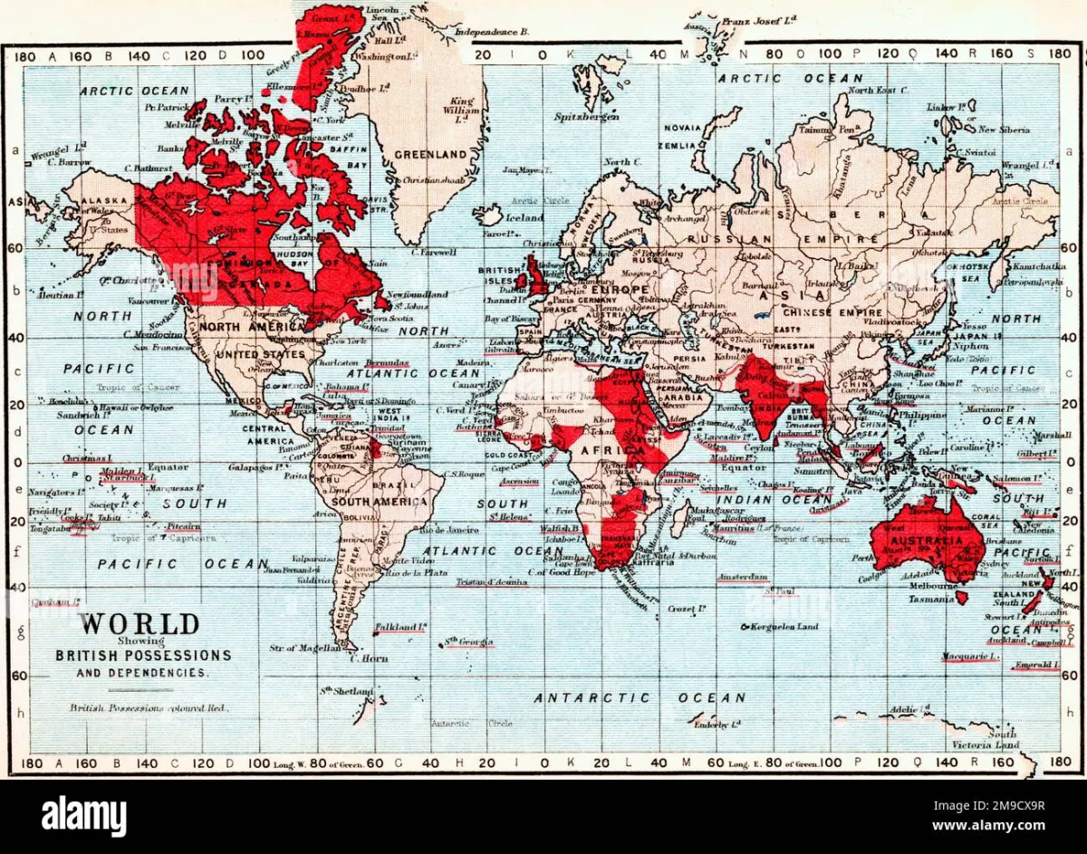 Photo: British Empire, via c8.alamy.com
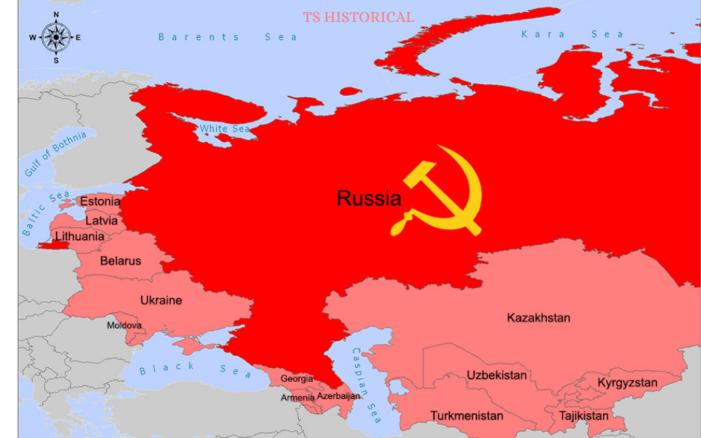 Photo: Soviet Union, via www.tshistorical.com
Students memorized these colors like a secret code. You knew French Guiana was French because it matched the pink of mainland France. You understood that Greenland belonged to Denmark because someone had decided both should be yellow-green on every map from Maine to California.
The Mercator projection — which made Greenland appear roughly the size of Africa — warped everyone's sense of scale in ways we're still correcting today. Alaska looked enormous. Africa looked smaller than it actually was. These distortions became embedded in American spatial thinking for generations.
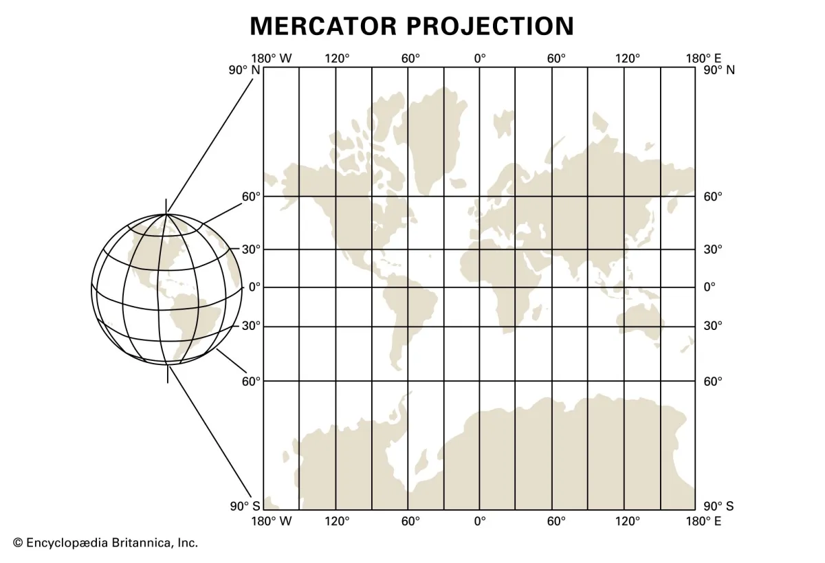 Photo: Mercator projection, via cdn.britannica.com
The Ritual of Learning Geography
Teachers wielded long wooden pointers like conductors' batons, tracing routes across continents while students craned their necks to see. "Find the Nile River," Miss Johnson would say, and thirty pairs of eyes would scan that familiar beige expanse until someone spotted the thin blue line.
These maps came with their own geography of wear patterns. The area around Europe and North America would be faded from constant pointing. The Pacific Ocean might have a mysterious stain from that time Tommy accidentally hit it with his chocolate milk. The corners would curl slightly, creating shadow lines that became as familiar as the actual geographical features.
Students learned to read these maps like archaeologists. That dark smudge near the equator? That's where Mr. Peterson always pointed when talking about the Congo. The slight tear running through the Indian Ocean? That happened during the great map accident of 1973, but nobody ever got it fixed.
When Updates Came Every Decade
Unlike today's instantly updating digital maps, classroom maps aged like wine — slowly, and not always gracefully. Political changes took years to reach American classrooms. Students might spend their entire elementary education looking at maps that still showed East and West Germany, the Soviet Union, or Yugoslavia as single entities.
When new maps finally arrived, usually thanks to budget cycles or generous donations from map companies, it was an event. Teachers would dramatically unroll the new version, pointing out changes like they were revealing state secrets. "Look, class — Czechoslovakia is now two countries!"
These delays meant that American students often learned geography that was technically incorrect, but there was something valuable in that consistency. Everyone in your class, your school, your entire generation learned the same slightly outdated version of the world. It created a shared geographical vocabulary that transcended regional differences.
The Death of Shared Geography
Today's students learn geography from satellite images, Street View tours, and interactive digital globes that they can spin with their fingertips. They can zoom from space-level views down to individual buildings in seconds. They can see real-time weather patterns, population density heat maps, and 3D terrain models that make those old flat maps look like cave paintings.
But something was lost in that transition. Modern students might know more accurate geography, but they don't share the same geographical references. One kid learns about Africa from National Geographic Kids online. Another discovers Asia through gaming maps. A third explores Europe via Instagram travel influencers.
There's no single map that defines their generation's understanding of the world. No shared visual vocabulary built from staring at the same faded colors and familiar coastlines day after day, year after year.
When the World Was Smaller
Those old classroom maps made the world feel both vast and manageable. Vast because you could see how much ocean separated America from everywhere else. Manageable because it all fit on one wall, in one frame of reference that your mind could hold complete.
Students would trace imaginary journeys with their eyes, following shipping routes or air travel paths that teachers had drawn in white chalk. The world had clear edges, defined borders, and a logical color-coding system that made sense of global complexity.
Today's infinite scroll geography — where you can zoom deeper and deeper into satellite imagery until you're looking at individual cars in parking lots halfway around the world — offers incredible detail but loses that sense of the whole. We've traded shared geographical literacy for personalized geographical exploration.
The old classroom map was a democracy of ignorance and wonder. Everyone started from the same place, learned the same distortions, and built their understanding of the world from the same imperfect but universal foundation. In our rush toward geographical accuracy, we may have lost something equally valuable: the shared experience of discovering the world together, one pull-down map at a time.